bullseye is an R package which calculates measures of
association and other scores for pairs of variables in a dataset and
helps in visualising these measures in different layouts. The package
also calculates and visualises the pairwise measures for different
levels of a grouping variable.
This vignette gives an overview of how these pairwise variable measures are visualised. Calculation details are given in the accompanying vignette.
# install.packages("palmerpenguins")

library(bullseye)
library(dplyr)
library(ggplot2)
peng <-
  rename(palmerpenguins::penguins,
           bill_length=bill_length_mm,
           bill_depth=bill_depth_mm,
           flipper_length=flipper_length_mm,
           body_mass=body_mass_g)
Visualising associations
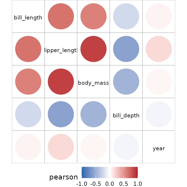
The usual starting point is the visualisation of a correlation of numeric variables:

If you wish to also include factor variables, use an alternative to
pair_cor which accepts numeric and factor variables, eg
pair_cancor. To see the available methods which handle all
variable types use
filter(pair_methods,nn&ff&fn)
#> # A tibble: 3 × 7
#>   name        nn    ff    fn    from                range ordinal
#>   <chr>       <lgl> <lgl> <lgl> <chr>               <chr> <lgl>
#> 1 pair_ace    TRUE  TRUE  TRUE  acepack::ace        [0,1] FALSE
#> 2 pair_cancor TRUE  TRUE  TRUE  cancor              [0,1] FALSE
#> 3 pair_nmi    TRUE  TRUE  TRUE  linkspotter::maxNMI [0,1] FALSE
Alternatively, if you wish to show different association measures for
correlation for numeric variables and cancor for non numeric, plot the
result of pairwise_scores:
plot(pairwise_scores(peng), interactive=TRUE)Adding interactive=TRUE means tooltips are
available.
By default variables in this plot are re-ordered to emphasize pairs with maximum absolute scores. This re-ordering uses hierarchical clustering to place high score pairs adjacently, and also to push high score pairs to the top-left of the display.
Visualising multiple scores
The pairwise structure has multiple association scores
when each (x,y) pair appears multiple times in the pairwise
structure.
scores <- pairwise_scores(peng, by="species")
plot(scores, interactive=TRUE)
The bullseye plot shown here has a pie wedge representing the conditional correlations. The overall or ungrouped correlation is shown in the pie center. As there are multiple scores for each (x,y) pair the ordering algorithm is based on the maximum of these scores.
An alternative ordering algorithm gives emphasis to pairs with the largest difference in the scores:
plot(scores, var_order="seriate_max_diff", interactive=TRUE) Pairs of numeric variables exhibit Simpsons paradox if the ungrouped correlation is negative and the grouped corelations are positive (or vice-versa). This is present for the pairs (body_mass_mm, bill_depth_mm) and (bill_depth_mm, bill_length_mm).
The island variable is also associated with the penguin dimension variables. However, this is mostly because two of the species (Gentoo and Chinstrap) are located on one island only. For these species, the score values for island and the other variables is NA, shown in grey.
If the pairwise structure has the additional column n
for the number of observations in each score calculation, the bullseye
plot has slices in proportion to n. In this display we see
there are far fewer Chinstraps than Gentoos or Adelies.
pairwise_scores(peng, by="species", add.nobs = TRUE)|>
  plot(interactive=TRUE)
Multiple pairwise scores also occur when pairwise data
structures are combined:
mscores <-
bind_rows(
  pair_cor(peng),
  pair_cor(peng, method="spearman"),
  pair_dcor(peng),
  pair_ace(peng)
) |> filter(pair_type=="nn") |>
  mutate(value=abs(value)) # convert all scores to 0-1

plot(mscores, interactive=TRUE)
In this case the various measures of association are fairly
consistent. For the bill_depth variable the ace
correlations are higher than the others, indicating the presence of a
non-linear association.
Visualising multiple scagnostic scores
sc <- pair_scagnostics(peng)
plot(sc, interactive=TRUE)
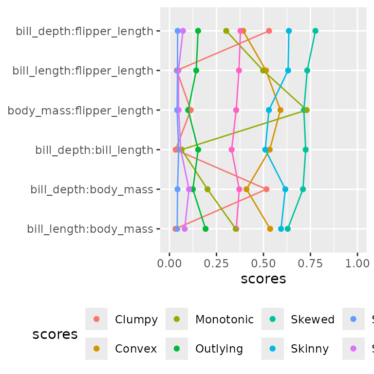
With many scores for example with scagnostics, an alternative display is perhaps easier to read.
So we offer an alternative plot of the pairwise
structure:
plot(sc, type="linear", geom="tile")
The default ordering arranges the variable pairs in order of their maximum score. Here all the high-scoring pairs involve year, which is not surprising as year takes just three distinct values.

According to the scagnostic measures, all pairwise scatterplots exhibit skewness, and body_mass:flipper_length scores highly on the outlier measure.
Linear display for filtered pairwise objects
We use the American Community Survey (2012) from the R package
openintro which contains results from the US Census
American Community Survey in 2012.
| Variable | Description |
|---|---|
| income | Annual income |
| employment | Employment status with categories not in labor force, unemployed, employed |
| hrs_work | Hours worked per week |
| race | Race of the participant with categories white, black, asian or other |
| age | Age of the participant in years |
| gender | Gender with categories male or female |
| citizen | Whether the person is a U.S. citizen |
| time_to_work | Travel time to work, in minutes |
| lang | Language spoken at home with categories english or other |
| married | Whether the person is married |
| edu | Education level with categories hs or lower, college, grad |
| disability | Whether the person is disabled |
| birth_qrtr | The quarter of the year that the person was born with categories jan thru mar, apr thru jun , jul thru sep, oct thru dec |
acs12 <- openintro::acs12

scores <- pairwise_multi(acs12)
The scores contains various pairwise measures for the 78
variable pairs. Note that the calculation of correlations for the
variables (employment, time_to_work) gives NA, because all observations
that have a non missing time_to_work have employment=employed.
filter(scores, x=="employment", y=="time_to_work")
#> # A tibble: 3 × 6
#>   x          y            score  group value pair_type
#>   <chr>      <chr>        <chr>  <chr> <dbl> <chr>
#> 1 employment time_to_work ace    all      NA fn
#> 2 employment time_to_work cancor all      NA fn
#> 3 employment time_to_work nmi    all      NA fn
Many of the scores will be low, so we pick out the pairs with a score of .25 or above to display:
mutate(scores, valmax = max(abs(value)), .by=c(x,y))|>
  filter(valmax > .25) |>
  plot(type="linear",geom="point", interactive=TRUE)
employment:income has the highest score, measured using
ace, suggesting a higher association for transformed
income.
The ace_cor function calls acepack::ace
(handling factors and missing) and shows that ace picks a transformation
that compresses high income values.
Similarly age:income has a high ace score, and a plot of
these two variables shows income goes up with age until about age 40 and
then drops off.
Next, we calculate scores by race and filter those x,y pairs with high values and high differences:
group_scores <- pairwise_scores(acs12, by = "race")

# filtering variable pairs with a range of 0.25 or greater

mutate(group_scores, valrange = diff(range(value)),valmax = max(abs(value)), .by=c(x,y))|>
  filter(valrange > .25 | valmax > .4) |>
  plot(type="linear", geom="point", pair_order = "seriate_max_diff")+
   theme(legend.text = element_text(size = rel(.5)), legend.title = element_text(size = rel(.5))
  )
Asians have much higher association than other groups for many of the variables. Employed Asians report much higher hours worked:
ggplot(data=acs12, aes(x=employment, y=hrs_work))+
  geom_boxplot()+
  facet_grid(cols=vars(race)) +scale_x_discrete(na.translate = FALSE)
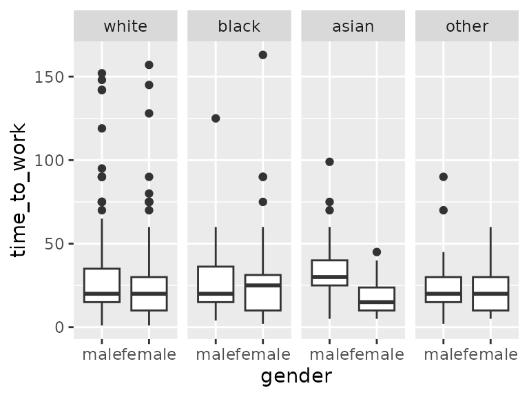
For Asians, there is a big difference in travel time to work for genders compared to other races.
ggplot(data=acs12, aes(x=gender, y=time_to_work))+
  geom_boxplot()+
facet_grid(cols=vars(race)) 
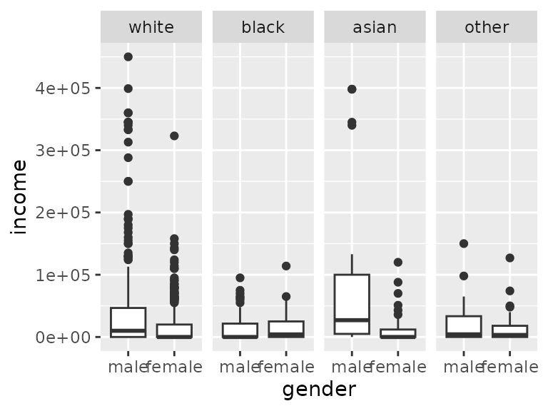
For Asians, there is a big difference in income across genders compared to other races.
ggplot(data=acs12, aes(x=gender, y=income))+
  geom_boxplot()+
  facet_grid(cols=vars(race))
So Asians work more than other groups, but Asian women commute less and earn less.